Introduction:
In this step-by-step tutorial, we will explore the bank failures that occurred between 2005 and 2023 using Power BI. Specifically, we will use publicly available data to create a visualization that showcases the year of bank failures, the number of banks that failed in each year, and the value of assets associated with the failed banks. By following this tutorial, you will gain insights into the patterns and trends of bank failures over time.
Visualization Description:
To effectively represent the data, we will utilize a Scatter Chart, which allows us to incorporate three important dimensions:
- The X-axis will represent the years of bank failure.
- The Y-axis will display the number of banks that failed in each specific year.
- The size of the bubbles in the chart will correspond to the value of assets associated with the failed banks in each year.
Through this visualization, we aim to illustrate the following narrative: In 2008, a few large banks experienced failures, which resulted in a multi-year crisis. Subsequently, numerous smaller banks faced failure in the following years. Additionally, we observe that the total value of bank assets associated with the March 2023 failures is comparable to that of 2008. The likelihood of a similar scenario repeating in 2023 remains a question best addressed by experts.
Step-by-Step Tutorial:
- Obtaining the Data:
- Launch Power BI Desktop and navigate to Power Query editor.
- Select “Get Data” and choose “From Web.”
- Open the GitHub repository and copy the raw link to the “bank-failure-data.csv” file.
- Data Transformation:
- Rename the query to “DataSource.”
- Promote headers to ensure proper column naming.
- Adjust the data type of value columns to Whole Number.
- Adjust the data type of date columns to Date.
- Close and load the data to the model.
Data Model:
- 3.1 Create a New Column “Year”:
- Utilize the formula: Year = YEAR(DataSource[Date].[Date])
- This column will serve as the basis for generating a new summarization table in the subsequent step.
3.2 Create a New Table “Data”:
- Utilize the formula: Data = SUMMARIZE(DataSource, DataSource[Year], “Value”, SUM(DataSource[Assets]), “Banks”, COUNT(DataSource[Bank]))
- This summarized table will be utilized in the visual to determine the number of banks that failed in each specific year.
3.3 Create a New Column “Value $B” in the “Data” table:
- Utilize the formula: Value $B = “$” & ROUND(Data[Value] / 1000000000, 1) & “B”
- This number formatting will enhance the readability of values in the visualization.
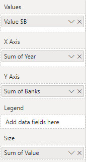
Visualization:
- 4.1 Create a Scatter Chart with the following data:
Conclusion:
By following this step-by-step tutorial, you have successfully created a compelling visualization using Power BI to explore bank failures between 2005 and 2023. The Scatter Chart provides valuable insights into the patterns and trends of bank failures over time.